Threshold
A site blocker built for the moment willpower fails.
Threshold is a free browser extension that permanently blocks the sites a person has decided are no longer for them. Unlike productivity blockers, it has no quick "disable for an hour" escape. Every change is gated behind two things: a real accountability partner, and a 72-hour cooldown. The design assumes the user installed it during a moment of clarity, and must be protected when that clarity wears off.
The Break and Build team designed, built, and shipped it in roughly a month. It went live on the Chrome Web Store in May 2026 and reached Microsoft Edge and Mozilla AMO within weeks.
The problem
Most site blockers were built for productivity — for the engineer who wants to ship without checking Twitter. They make it easy to disable themselves, because disabling yourself is part of that workflow.
But the people who actually need a blocker aren't fighting distraction. They're trying to survive a specific 2 AM moment: tired, lonely, dissociated, drunk. In that moment, the user has no willpower left. A blocker that asks "are you sure?" is a blocker that loses.
Existing tools failed at this. They had:
- One-click overrides
- Settings the user controlled alone
- "Disable timers" that reset with a click
- Performative friction, not real friction
The gap wasn’t a feature. It was a design philosophy.
The principle
A single line drove every decision:
The user installed this when they were strong. The design must protect them when they are tired, drunk, or sad at 2 AM. There is no clever bypass.
Once that became the constraint, the architecture wrote itself. If there's no clever bypass, the unlock can't be controlled by the user — so it must be controlled by someone else. If it's controlled by someone else, that someone must be a real human the user trusts. And if a real human is involved, there must be enough delay to make the user want to call them back.
Hence: a verified partner, a 72-hour wait, no exceptions.
System design
Threshold is three pieces, deliberately separated so no single one is a bypass point.
Chrome MV3 · the user-facing layer
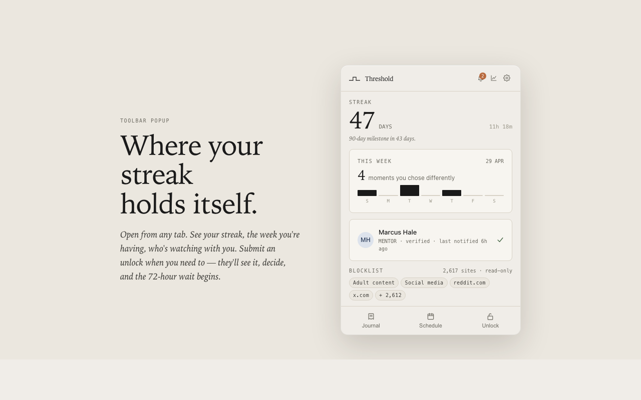
Handles blocking, the popup, onboarding, the journal, the streak, and the full-page block screen. Uses triple-redundant blocking (declarativeNetRequest + webNavigation.onBeforeNavigate + tabs.onUpdated) so blocks hold in incognito and on cold-start race conditions where one layer silently fails.
Supabase Edge Functions + Postgres (RLS)
Stores partner identity, unlock requests, and the verified-install record. Eight edge functions, each scoped to one verb: register-install, submit-unlock, partner-decide, sync-unlock-requests, record-attempt, send-weekly-summary, notify-reset, partner-verify. No user account; the install ID is the only identifier.
Vercel static site · what the partner sees
Email links land here for verification and unlock decisions. The partner never installs anything. They just get a calm page that says "your friend wants to unlock Twitter — approve or deny."
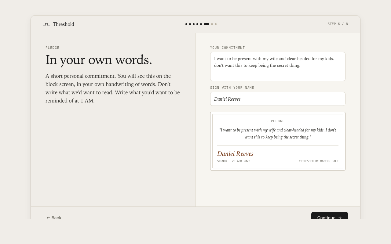
The user’s pledge signature and commitment code are stored locally as a PBKDF2 hash with a per-install salt. The original code is never persisted. Resetting setup notifies the partner.
Three decisions worth narrating
1. The 72-hour wait
Most blockers use 5, 15, or 60-minute "are you sure?" delays. Those are productivity timers — useless at 2 AM, because the urge outlasts them.
72 hours was chosen because it is:
- longer than any acute urge,
- long enough to span at least one full sleep cycle (often three), and
- short enough that legitimate changes ("I want to remove news from the blocklist") aren't punished.
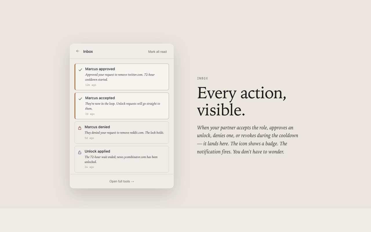
It also forces a conversation. The partner sees the request the moment it's submitted, not when the cooldown ends. The user has to want this enough to wait — and to wait while a friend knows they're waiting.
2. The partner is a person, not a feature
Other accountability apps gate behind the idea of a partner — paste in an email, never confirm they exist. Threshold actually verifies the partner. They get an email, they have to click accept, and the lock doesn't engage until they do.
This was the hardest call. It meant Threshold couldn’t be useful on the first day of install. It also meant a chunk of installs would stall at partner-verification. But the alternative was a feature shaped like accountability without the substance — which is exactly what the product exists to refuse.
3. No accounts, no telemetry, no growth loops
Threshold has no signup, no analytics, no referral program, no upgrade prompt. The only data leaving the device is what the partner needs to do their job: that an attempt happened, that a request is pending, that a cooldown has ended.
This was a constraint, not a goal. A product about protecting users from themselves loses credibility the moment it starts harvesting them.
A bug worth showing
A week after launch, a user's partner started receiving the same "unlock is now active" email every 30 seconds — 16,000+ entries before it was caught. The cooldown was being completed client-side but never reported to the backend, so the next sync reverted the local state, and the loop fired forever.
Four small changes:
- Treat client-side completion as a terminal state the backend can't revert.
- Guard the completion check with the
completedAttimestamp (which survived syncs). - Cap the outbox at 500 entries so a future loop can't grow unbounded.
- Ship a one-time cleanup that collapses duplicate entries on update.
This section is included because portfolio cases tend to omit the embarrassing parts. This bug taught more about distributed-state design than any clean architecture diagram would have.
Visual & verbal design
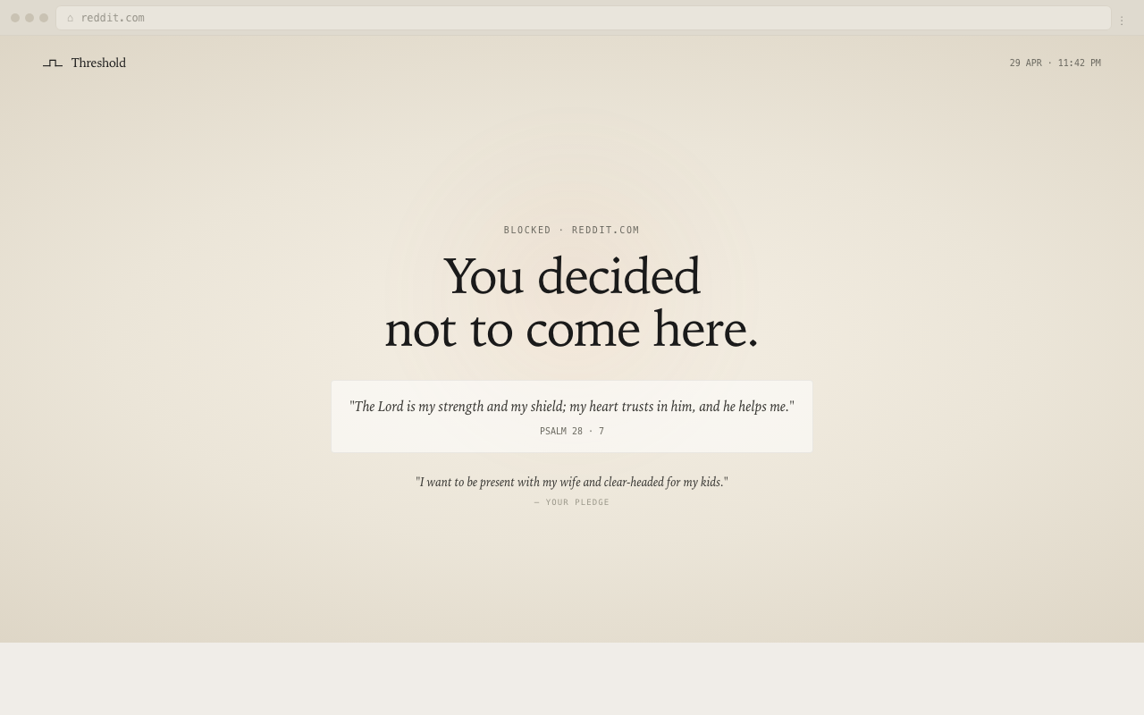
The brand is deliberately quiet. Source Serif 4 for body and headlines, IBM Plex Mono for small labels, a muted warm palette. No screenshots of "21,348 sites blocked!" No leaderboards. No streak-shame.
The voice is sparse and slightly literary:
- "A door you chose to close."
- "You decided not to come here."
- "Plain numbers, no spin."
- "The decision was made by the version of you who was paying attention. Threshold's job is to keep that decision intact when present-you forgets."
Every word is chosen to remind the user that they are not the enemy — past-them is the ally, present-them is just tired.
Outcome
- Live on the Chrome Web Store, Microsoft Edge Add-ons, and Mozilla AMO
- Website at jointhehold.com
- Free forever, no upsell, no account
- v1.0.1 patch shipped to fix the notification-loop bug
Early reviews
"The best site blocker I have used. Easy to setup and is packed with amazing features."
Chrome Web Store review"This extension has been a big life saver to help curb my social media addiction. I recommend!!"
Chrome Web Store reviewReflections
The hardest thing about designing Threshold wasn't the engineering. It was resisting the constant pull of conventional product instincts — make the friction lighter, add a "skip this" button, soften the onboarding, A/B test the cooldown length. Every one of those changes would have made the product less effective at the only thing it has to do.
Building a product whose central feature is refusing to do what the user asks is a strange exercise. You spend the whole project saying no to yourself.